TL;DR
💪 Integrated design thinking methodologies for improved collaboration.
💪 Aligned design languages across platforms.
💪 Decreased QA tickets by 20% and enhanced release flows.
💪 Developed infrastructure for the design and FE team to facilitate better product scaling.
______________________________________________________________________
Overview - Deep Instinct
Deep Instinct is a b2b endpoint cyber security solution that utilizes a deep learning framework to safeguard a company's valuable data from cyber attacks.
As part of the product team, I served as the only designer among two PMs, collaborating with 60 developers across five teams to work on various platforms and products, such as endpoint agents (Mac, Windows, Android, and iOS) and the web-based management console.
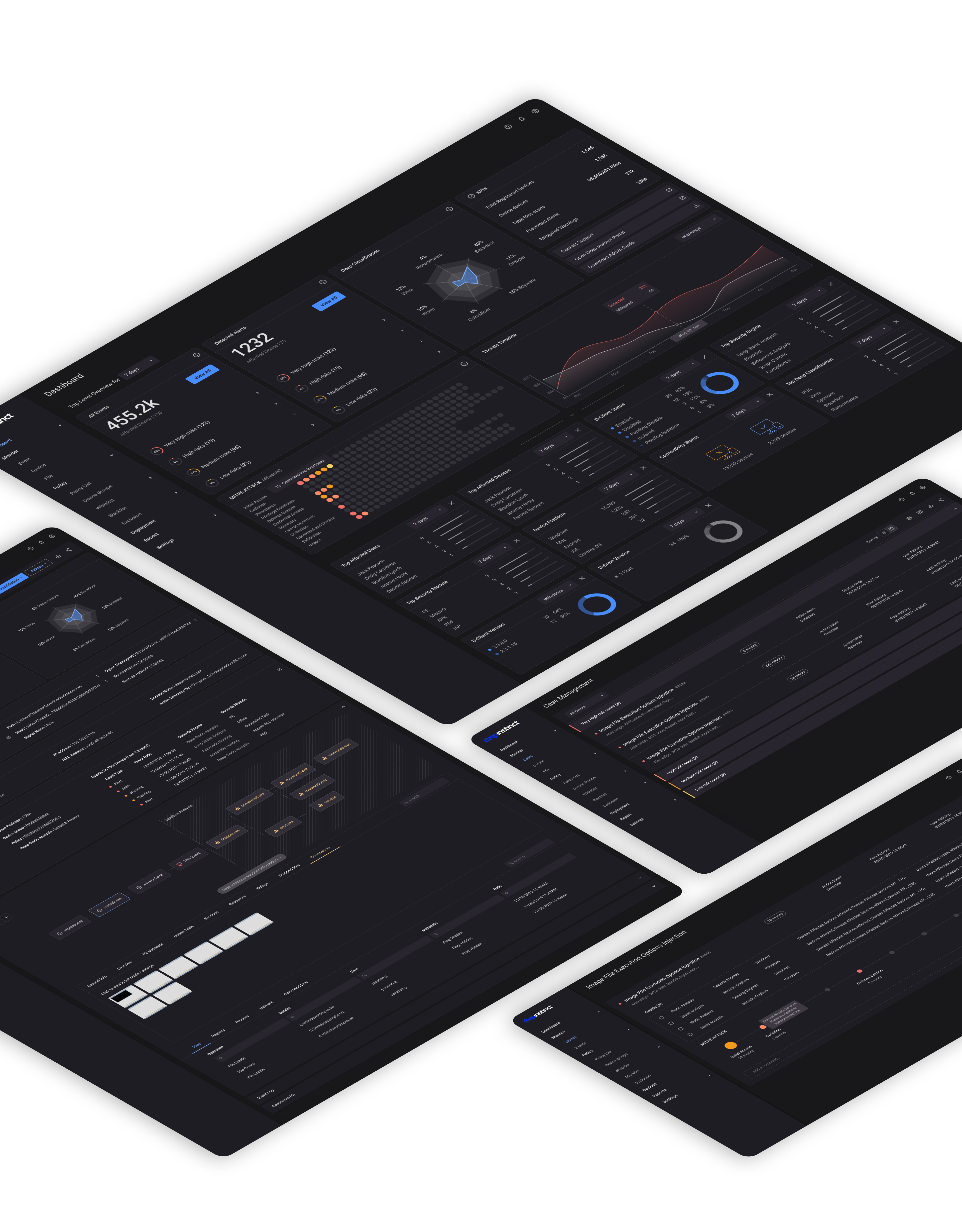
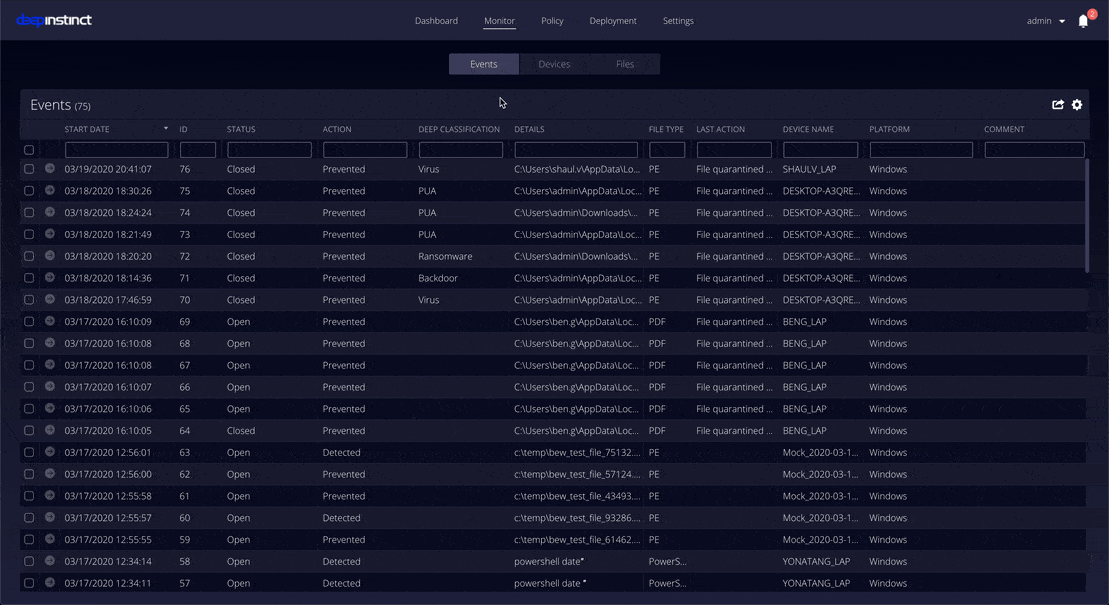
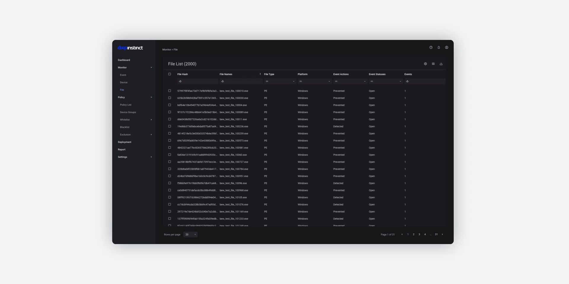
Overview - the management console
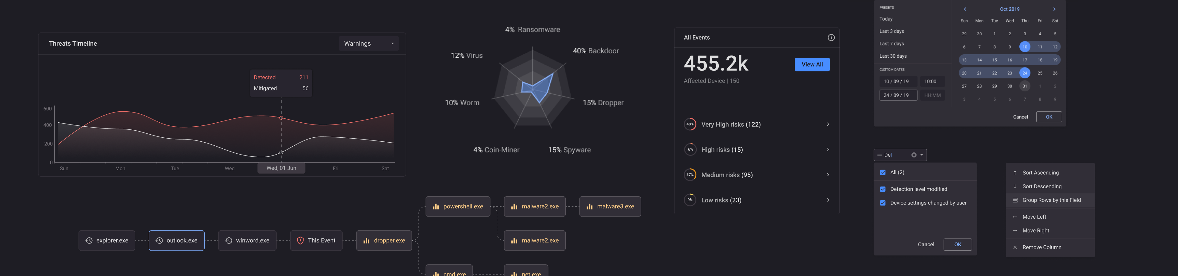
Cybersecurity EDR (endpoint detection & response) solutions present overwhelming amounts of data, leading to complex dashboards, prone to errors, and negative impacts.
The console (the admin's dashboard) is feature-rich yet challenging, with a lengthy timeline for changes due to R&D methodologies and code base.
The Challenge
Revamp the user experience for the management console and endpoint apps, enabling users to unlock current features and capabilities, while also enhancing the infrastructure to accommodate future business requirements, such as scaling up and expanding the customer base to include corporate clients, not just SMBs.
My main objective was to optimize the product design process to ensure it is scalable, adaptive to changes in user behavior, and aligned with business growth and product evolution.
Research
To comprehend the redesign's impact on business needs and goals, I interviewed stakeholders and peers, while also creating product flow maps to identify primary pain points.

Complicated business logic and a long learning curve
Complicated business logic with a feature-rich product design and a long learning curve due to inconsistencies in design patterns.
Low UX and product maturity level
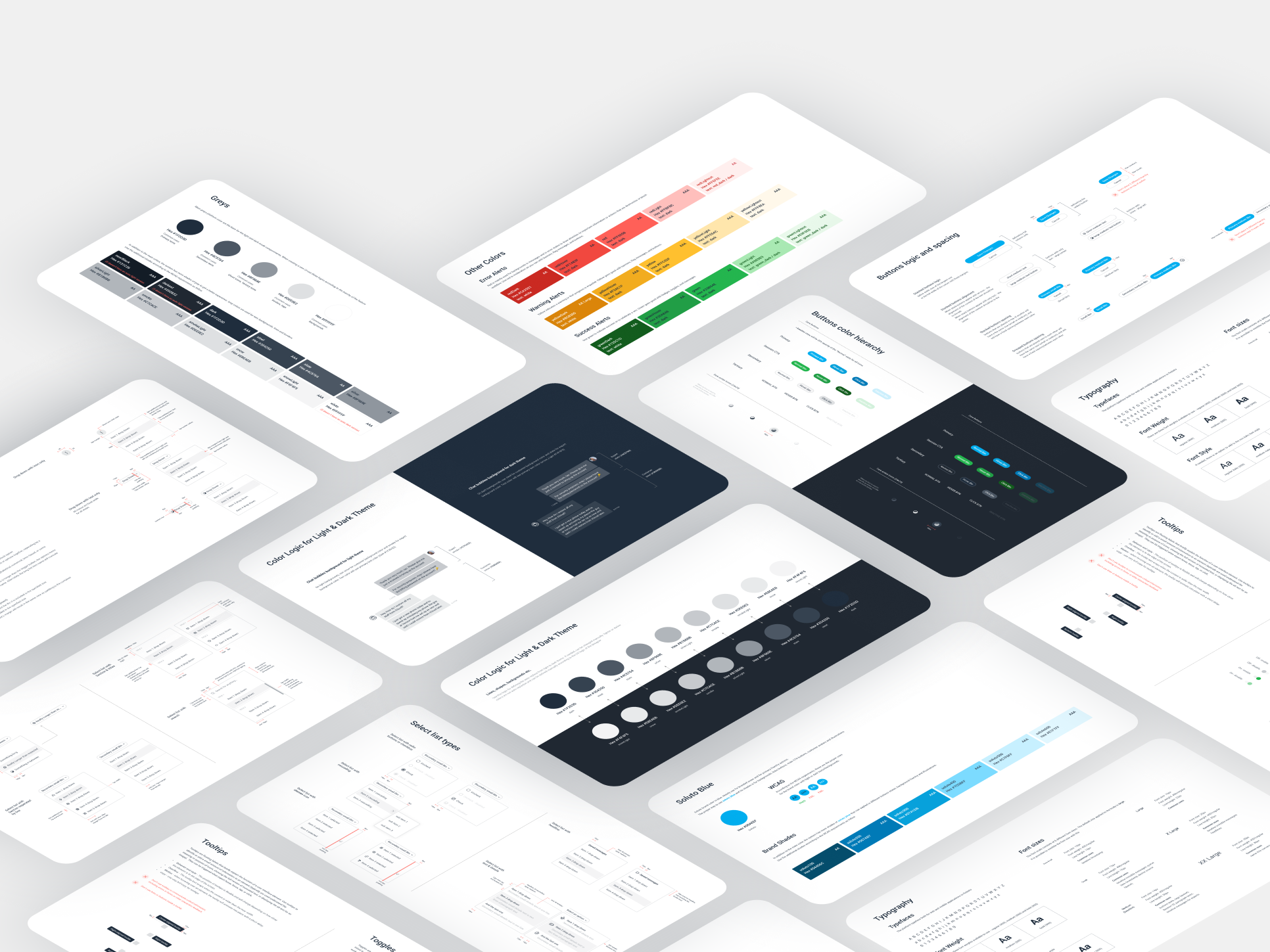
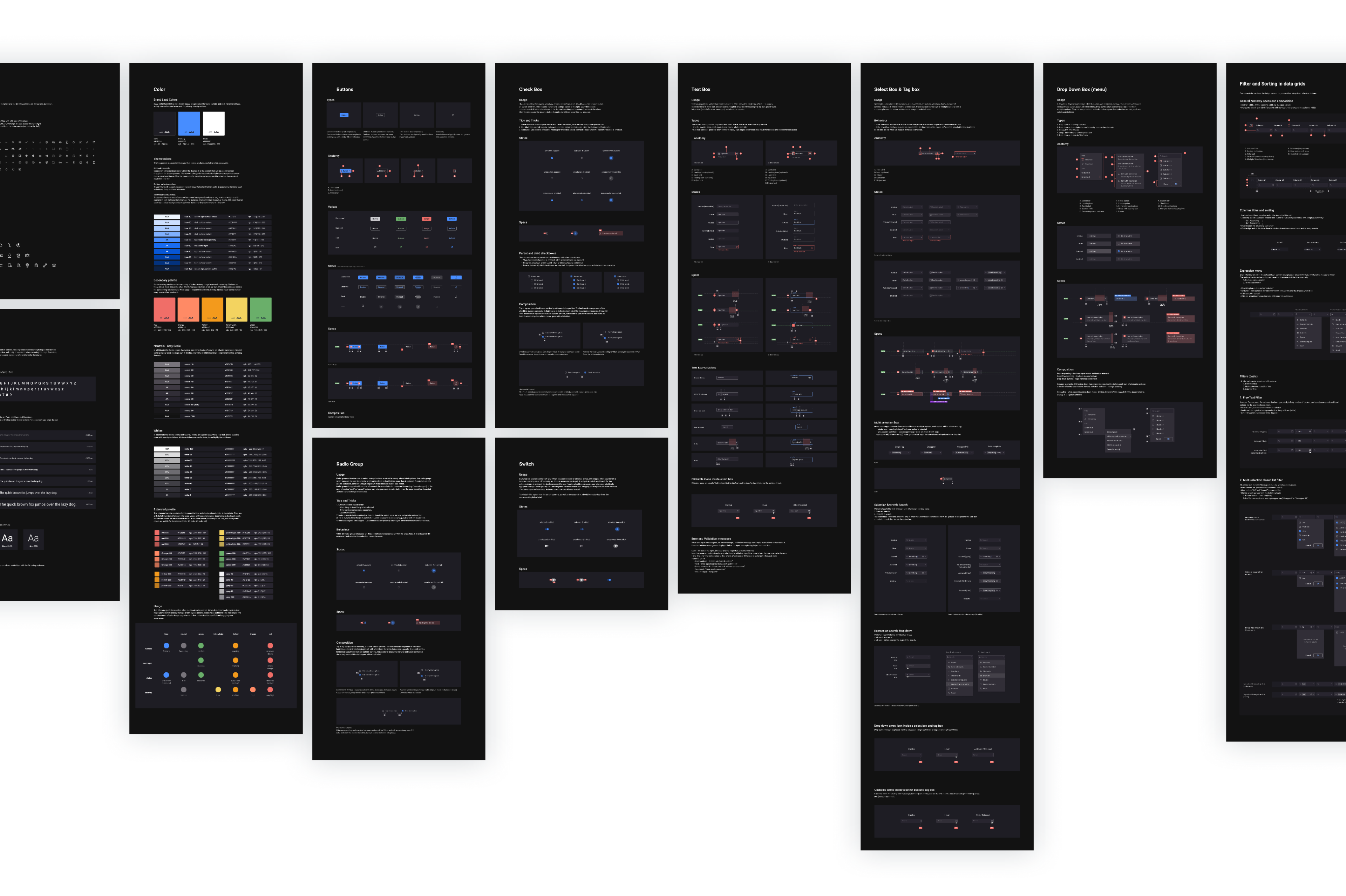
Low UX and product maturity levels are caused by an arbitrary information architecture, inconsistent UX patterns, lack of clear design guidelines, and separate native teams working on different platforms.
The web console had over 250 text styles, and over 120 color shades implemented, and lacked distinct design guidelines for both the design and front-end teams to adhere to.
Product priorities and long-release flow
The product team's focus on adding new features and fixing performance issues in each release took priority over unlocking the existing product value for both existing and new users. As a result, release flows became longer and the learning curve for users became more complex, with no significant improvement in overall client satisfaction.
As our business expanded and we began offering white-label services to enterprise clients, we faced a challenge in managing multiple versions and customizations using feature flags that met the specific needs of each client. The current approach did not allow for a sustainable long-term strategy to scale while also considering all client versions as a cohesive whole.
Design in a technical b2b startup environment
B2B companies typically have buyers who are not the end-users of their products or services, which poses a challenge in implementing user-centered decision-making and design-driven solutions.

Process mapping
Hypothesis
We believe that redesigning the management console while embedding a design system, will help to minimize the users' learning curve of the product, increase our ability to address dynamic business needs, and will enable us to execute new features faster.
What would success look like?
1. Good feedback from our clients, the sales team, and the training managers.
2. Reducing time to ship new features.
Execution
Dark mode validation for our interfaces
To start, I aimed to confirm the initial decision to implement a dark theme for our web app. After conducting research on the enticing trend toward dark mode, as well as analyzing our product goals and strategy, I concluded that incorporating a dark mode would align with our business and brand objectives.
However, it will be crucial to ensure that the interface, particularly the color scheme, enables easy scanning of statistics and focuses on essential data points. Achieving the appropriate balance of textual hierarchy will be key to this.
Find the design opportunity
During that time, one of our top business priorities was to meet our client's needs by rendering 1 million endpoints' data simultaneously, a significant increase from the 40,000 endpoints we previously supported.
This effort required a complete redesign of our front-end rendering mechanism, which provided an opportunity for me to present and evaluate my design system methodology.
Working closely with the front-end team, we identified the requirements for this undertaking and created a checklist of essential elements that could be integrated and tested during the project. Our primary objectives were:
• Enable improved data rendering in the front end to align with business goals.
• Enhance user experience when working with data grids.
• Integrate and test the design system methodology.
• Establish better documentation and workflow between the R&D and Product teams.
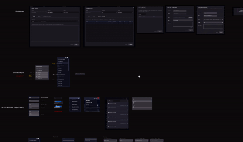
Existing elements' mapping

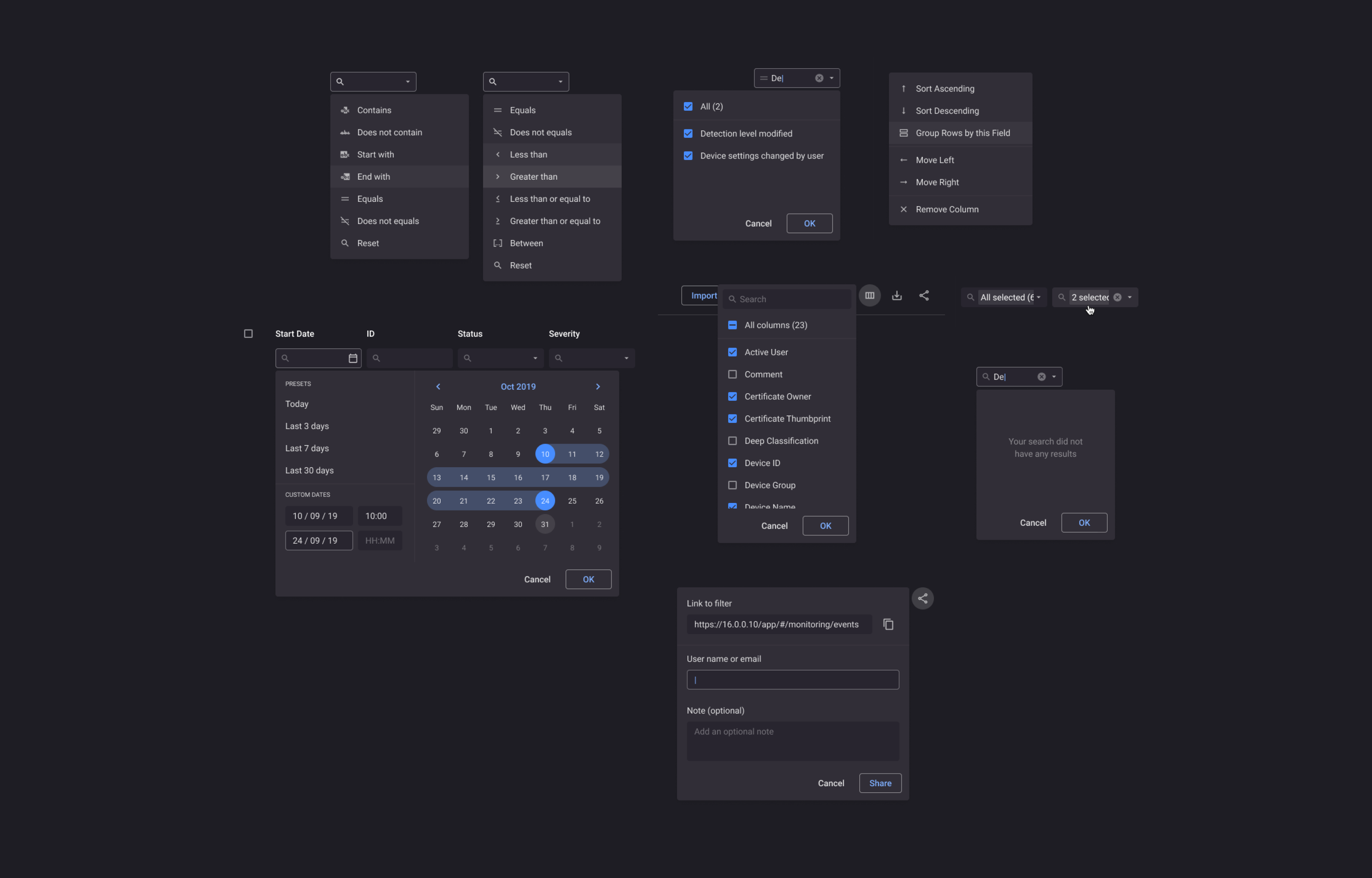
Existing table filter logic and UI
Existing table grid function and UI
What did we accomplish
✔️ Integrated components library to improve rendering and virtual scrolling of tables.
✔️ Enhanced existing data grid filters for a better experience.
✔️ Improved visibility and focal element hierarchy within table rows and filters.
✔️ Developed approachable patterns for common actions based on user needs.
✔️ Established the first blocks of the design system, enabling the completion of medium-priority tasks.
✔️ Conducted several small design sprints during the version and design phase to educate on UX importance and gain insight into user needs and perceptions.
In addition, we've added long-requested capabilities:
• Search inside closed list filters
• Add multi-selection options (including “all”)
• Sorting logic
• Enable preservation of the column size, order, sorting, and filtering view
• Intuitive clear filters option
• Better calendar handling
• Filter and table empty states
• Cell quick actions (copy, open in new window)
• Table pagination
• Filter operators
New components design
New design
Learn and validate
During my first 6 months, I was able to build and integrate an MVP design system, improve core user flows within the web management console, synchronize the design language across all platforms while adapting to each platform's constraints, and involve R&D peers in the production process to promote more design-driven company culture.
In addition, I validated some of my initial assumptions:
⚡ Education is crucial for raising UX maturity.
⚡ A design system is valuable, even when working solo.
⚡ A clear roadmap is crucial for a redesign of a b2b product.
⚡ Embracing small changes is necessary for delivering a good UX.
Next steps
Following the initial pilot involving the data grids, we resolved to proceed with enhancing more fundamental processes within the product. This primarily involved redesigning the dashboard, refining the core structure of form submissions flows, and augmenting the investigation capabilities to enable more effective monitoring.
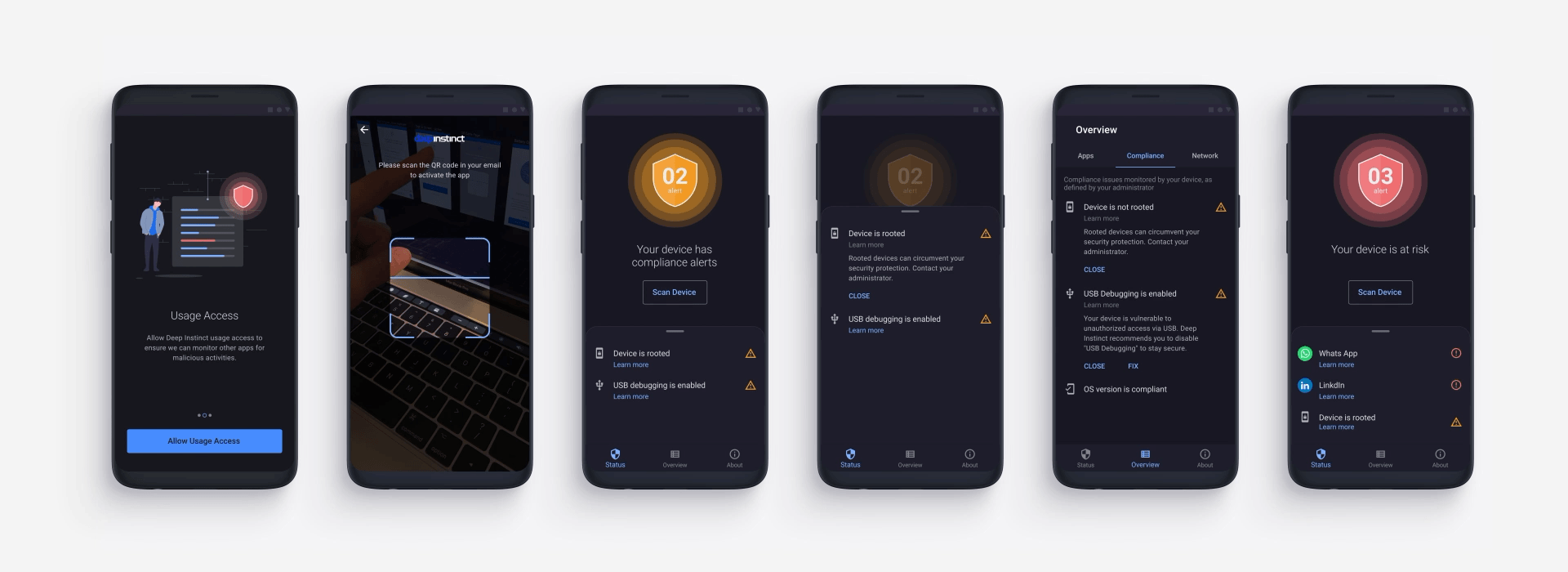
n addition, we utilized the same design language for the endpoint applications (Android, iOS, and Windows) and integrated a feature that allows for the inclusion of various skins in a simple and user-friendly way. This feature not only addresses the needs of our existing clients but also enables us to effectively meet sales and presentation requirements.