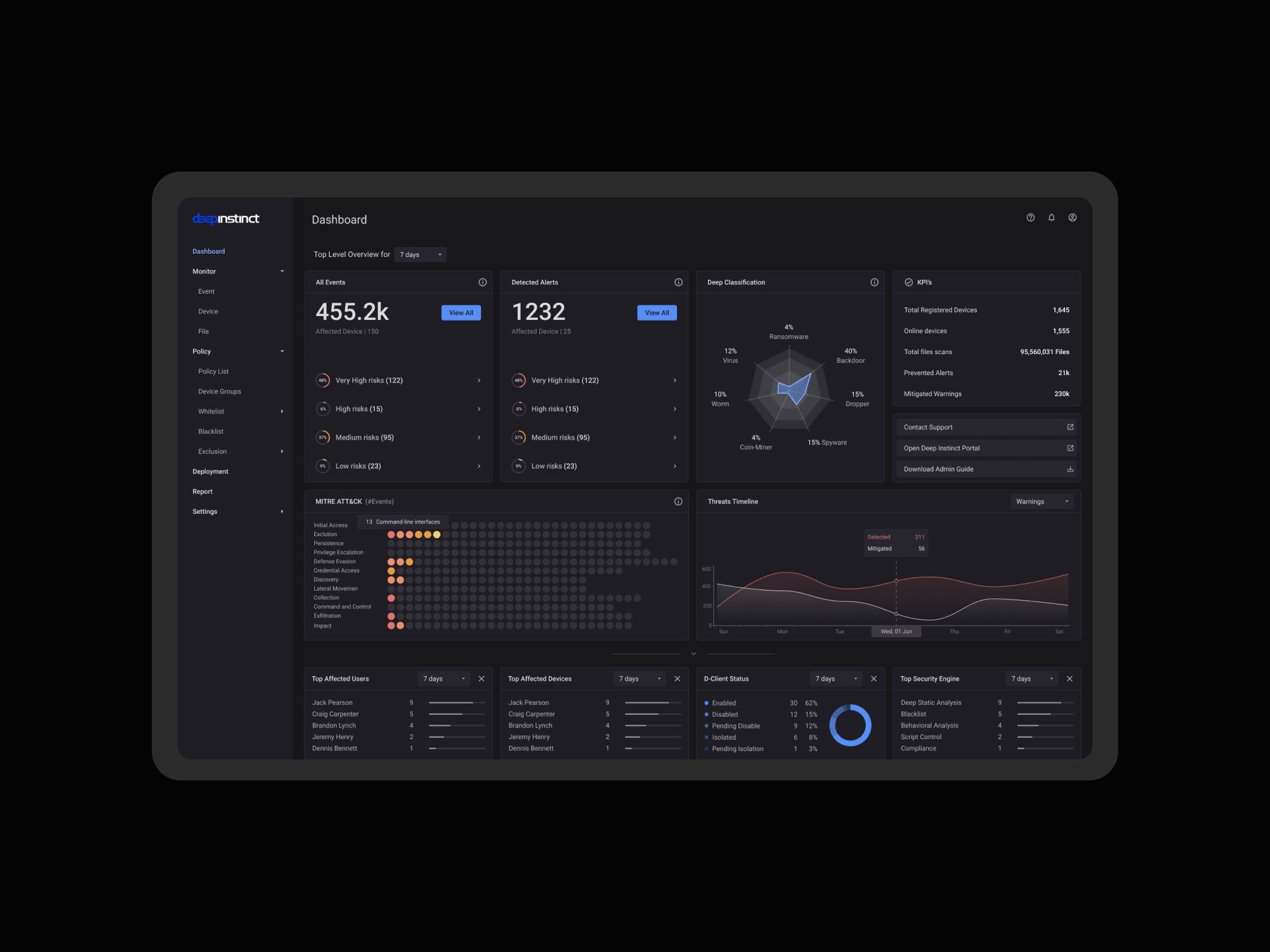
Anywhere Expert app' design system
Aug 2018 - Apr 2019, Soluto
TL;DR
💪 Reducing the time to launch and test new features.
💪 Reducing legacy issues and helping the domain’ KPIs.
💪 Enhanced team collaboration within the domain.
💪 Raising the design and code standards to the whole company.
______________________________________________________________________
The Challenge
As our domain continued to grow (we grew from one team located in TLV to 7 teams in two different time zones), we reached a tipping point where things suddenly became harder.
New employees brought with them new methodologies. The loose structure which allowed us to scale quickly before was not stable as we scaled, and new challenges emerged. Access to information, design standards and guidelines, design decision making and quality issues all became very real problems.
The Design Ops Team
We knew from the start that this effort is worth assembling a dedicated team. The talented team included a PM, three full-stack developers (one working remotely), and me, as the product designer.
Our goal was to unify our design language across platforms and empower designers and engineers to build solutions as parts of a greater whole, all while accelerating the design and development process.
Our mission was to provide agility to the whole product organization through centralized tools, systems, and services to enhance speed and quality of execution. With our mission in mind, we asked ourselves the following:
Scoping the Problem
🍄 Collecting requirements from the PMs, developers, and designers within the domain, to understand the current ecosystem and the parts that will be affected by the design system method:
• How often do you have to refer to something you did earlier?
• What are your current pain points?
• Without a design system, how many hours does it take you to X?
• What would be solved if you had a design system?
• What are the aspects of a design system that help you with your work?
• How should these aspects be delivered to you?
🔎 Collecting screenshots of all the basic UI components, defining similarity patterns and misalignments.
🔮 Understanding the product's short and long-term roadmap, so we can start with a quick win to test and demonstrate our effort and solution.
Research Findings
🎨 We found hundreds of colors (most of them were shades of grey) and text definitions hardcoded within each component. This working method didn’t allow us to scale, led to a lot of QA testing and extended the time to production for each new feature.
👯♀️ We found many solutions to the same elements across the platform, leading to a cognitive load and lack of consistency for the users (the Experts):
• Inconsistent padding or margins between elements
• Multiple types of buttons (and their usage)
• Uneven icons design
• Missing states definition and implementation
• Inconsistent button measurements
• Implementation bugs (colors, alignments etc.)
• Inconsistent types of box-sizing
• Inconsistent margins between buttons
Elements mapping of the current product
🌗 We found that the current implementation of our dark mode version created painful problems:
#1 New features were not tested and reviewed on the dark mode version, due to lack of “review checklist”. (design reviews were mainly done over the light theme).
#2 The dark mode was a relatively new ability that happened overnight by an initiative of one of the teams and got 40% adoption by the users. With that said, the implementation was partly, leading to many “legacy” features that didn’t work well, with no team ownership over the features.
#3 The dark mode option added 17% - 20% more development time for each feature (due to the manual building process in the front end).
#4 Dark mode UI problems findings
• Icons’ bad implementation was very visible
• Grey text got lower visibility over dark mode
• Text hierarchy switch when switching to the dark mode
• Colors were not accessible anymore over dark mode
Dark mode elements mapping of the current product
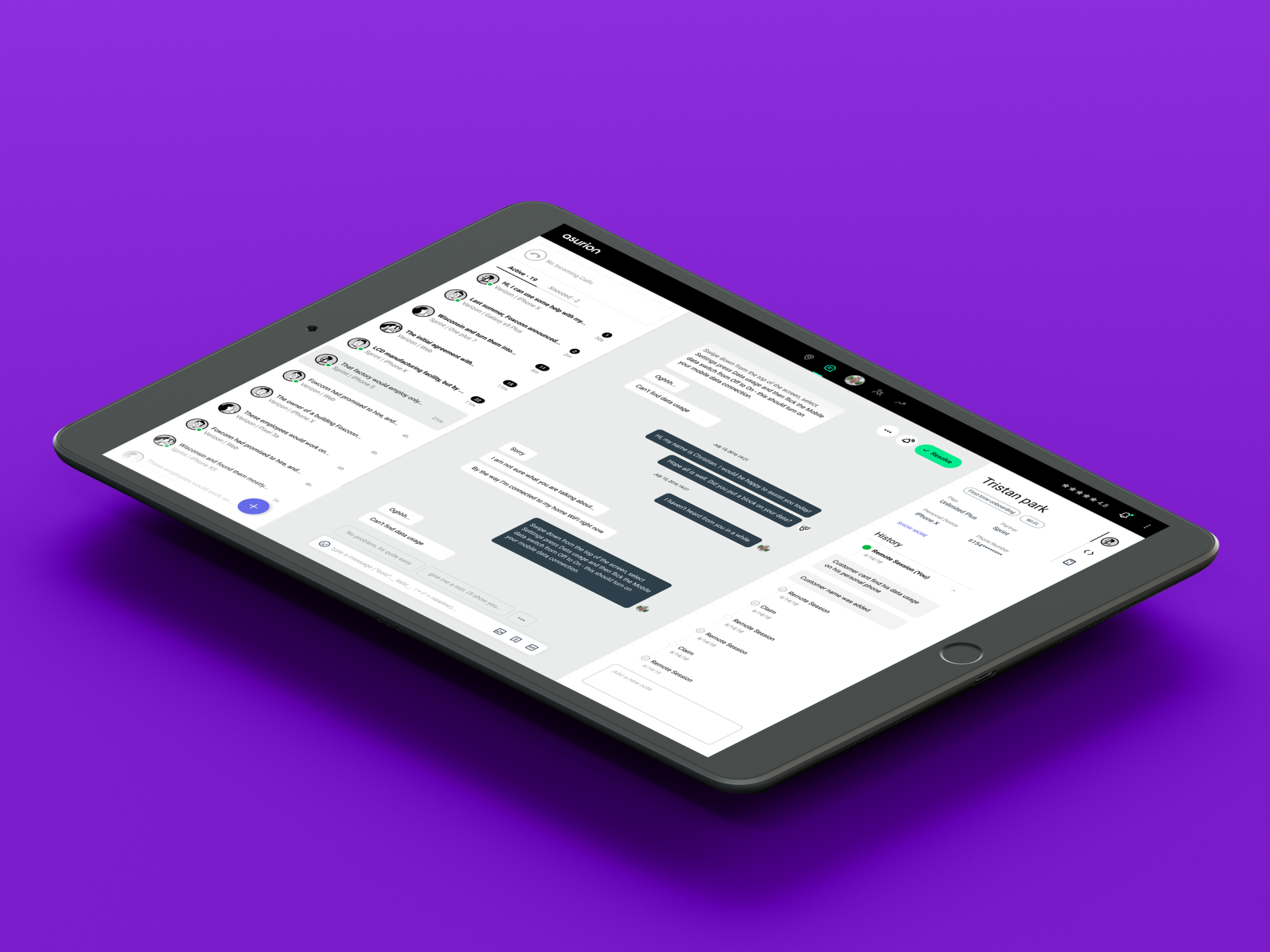
⭐ Experts’ star rating and the domain KPIs were affected by a major performance legacy (mostly because of collision of the code between the teams).
⚙️ Some of the product core abilities were not maintained properly while we scaled, due to the shifting of priorities between teams, leading to a bad experience as a whole.
🙄 Not all people were happy with the upcoming effort. Designers, developers and PMs were concerned we will affect their relevancy as professional individuals and were afraid that the process of designing within the boundaries of a design system will lead to a dull and uncreative product.
Building and launching the first version
After a few months of collecting, analysing and defining the first draft of our design system, we were excited to push and share our Anywhere Expert Design System:
⚡ Having bi-weekly domain meetings to show progress, get feedback, raise concerns and educate the teams on the design system logic and implementation.
⚡ Implementation of new working methods - building along with the product owners and stakeholders a working method for implementing new patterns and design solutions, while providing agility to the whole product organisation.
⚡ Creating a shared and scale code base for each pattern, reducing the amount of FE work on each feature, and reducing the amount of QA tests for each component and pattern.
⚡ Create a shared logic for switching between light and dark palette, enabling designers and developers to design and test over light mode without affecting the dark mode experience and accessibility.
Feedbacks and personal conclusion
I was really happy to become a major role in the path to a mature product. I learned a lot on the value of listening, how to define and communicate logical problems, the value in showing progress early and often and building advocates within the teams, how to work in the boundaries of the business needs and the user needs, and the process (and value) of creating a design system. Our main achievements were:
✔️ Shipping and testing new solutions and features took days instead of weeks, allowing us to focus on the product experience and the code improvement rather than chasing our tails:)
✔️ Creating better team collaboration within the domain, using a method we developed to add new patterns and design/code standards.
✔️ Reducing the legacy issues and helping the domain KPIs.
We inspired the whole company to adopt the effort of the team to the other domains.
And mostly, we created a better system for our Experts to work with on a daily basis.
