TL;DR
💪 Better SLA for end users and better productivity by the experts.
💪 Alignment with the scaled platform and new Asurion branding.
💪 Better system navigation.
______________________________________________________________________
Background
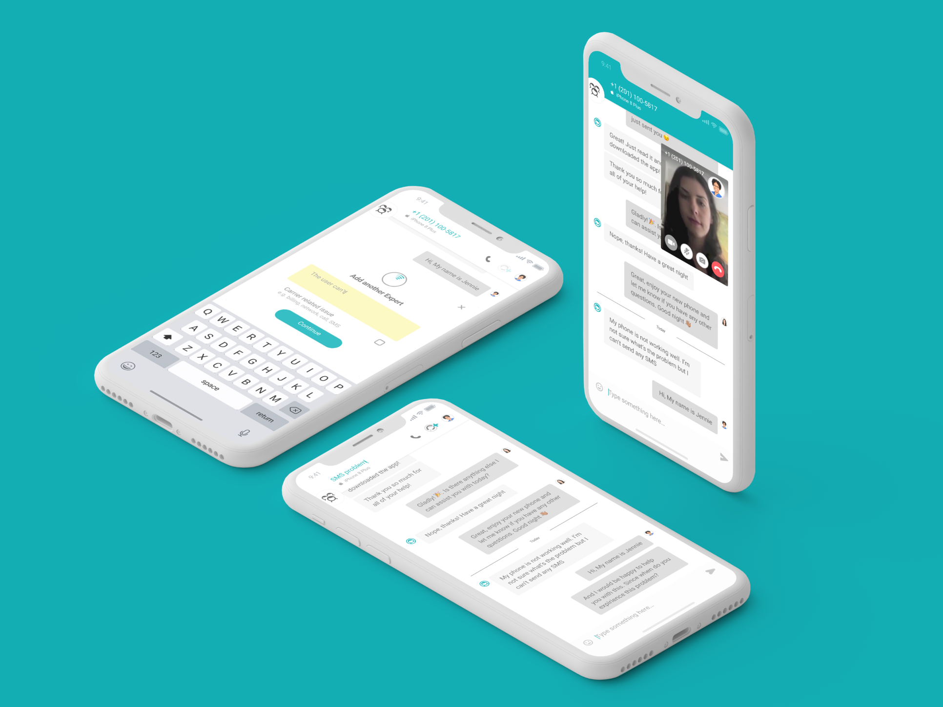
Anywhere Expert, a gigs-economy platform for IT experts, links Asurion's customers with proficient experts to enhance their devices' potential, beginning with messaging and VoIP services and gradually expanding to phone screen repairs, smart home gadget recommendations, and step-by-step device setup instructions.
Our services are enabled by our tech-savvy experts' knowledge, who are given the freedom to explore diverse work opportunities, work on their own schedules, and transform their passions into careers.
The Challenge/goal
Redesign the AE web app as a unified service experience for a wide range of emerging job types, with the scalability to add new jobs in the future, including home visits, a general evaluation dashboard, and community space.
Research
As a part of our user research efforts, we primarily focused on JTBD (jobs to be done) and expert surveys to identify key pain points and design opportunities. The following are the main takeaways from our research.
Starting a shift
Conducting remote sessions
Execution
Information Architecture and conceptual modeling
We designed the navigation and structure of the web app based on a conceptual representation of the system, emphasizing the remote support expert and conveying fundamental principles and basic functionality.
Navigation for Future Growth & Expansion
Our research and design findings led us to implement a fixed navigation bar in the app with the following features:
• A background bold color to frame the platform's content
• Emphasis on the central role of the expert
• Display the expert's star rating at all times as a key metric in expert evaluation
• Scalability of categories to accommodate future growth and expansion.
Optimizing A-Sync Messaging for Improved Response Time
We aimed to enhance the core value of our app, which is a-sync messaging, enabling experts to handle multiple customer sessions simultaneously and reducing response time for customers. By analyzing existing behaviors and metrics, we identified opportunities to improve the app as part of our web redesign.
Messaging main insights
AE messaging exploration
Expert queue design for cognitive efficiency
To minimize cognitive load and encourage experts to take on new sessions, we designed the left-side panel queue with the following features:
• VoIP calls are displayed at the top (if relevant)
• New sessions are displayed at the bottom, based on the expert's workload and scoring
• Ongoing sessions are prioritized in the queue and separated into ongoing and snoozed tabs.
The right toolbox
The right-side panel serves as a hub for experts to access information and tools to improve their service during and between sessions. The toolbox is organized based on context and content, with the ability to add more tools in the future.
In addition to the toolbox, the right-side panel displays and manages all notifications that experts receive during their shifts, regardless of job type or view.
